Case Study – Bravura Solutions Rebranding
The Bravura brand had an outdated look & feel and therefore didn’t reflect the company’s culture and positioning anymore. Besides, all brand assets were disconnected and used differently in each of Bravura’s offices around the world.
The Client needed a new brand strategy that would bring their brand to life, but also make it appealing to a global market.
The brand strategy and visual identity
The first step in the development of this new brand strategy was to interview the marketing team to define the objectives and concerns.
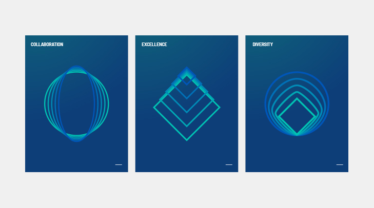
After many meetings, research and brainstorming sessions, the Slidemaster creative team aimed for a distinctive brand positioning that would emphasise on Bravura’s brand values – Collaboration, Excellence and Diversity.
This formed the foundation of all the design and creative routes that were explored and presented.
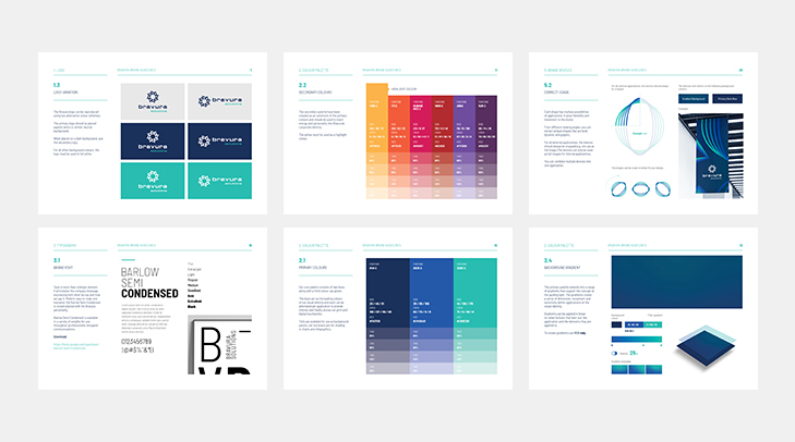
Once these elements were in place, Slidemaster then ideated and developed visual concepts including a refined logo, a colour palette, typography and brand illustrations that formed the new brand identity and captured the company’s brand essence.
The strategy for the visual identity was to develop a distinctive brand illustration for each of Bravura’s brand values; set to be unique, dynamic and versatile.
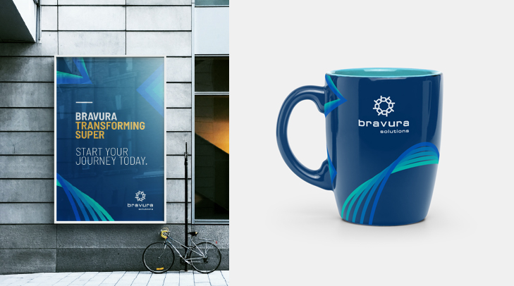
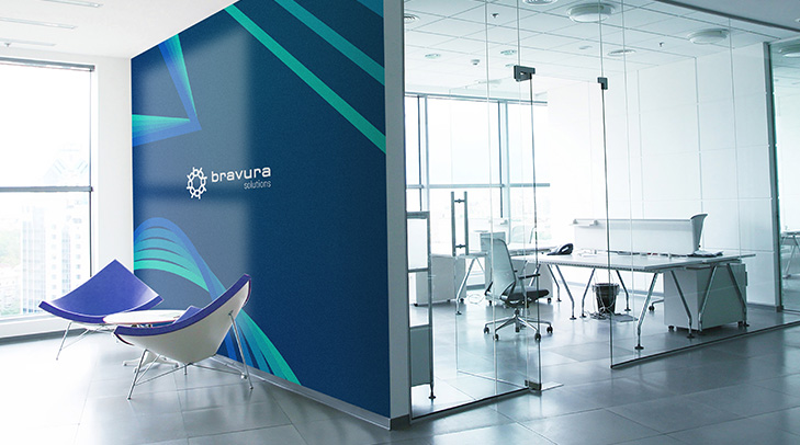
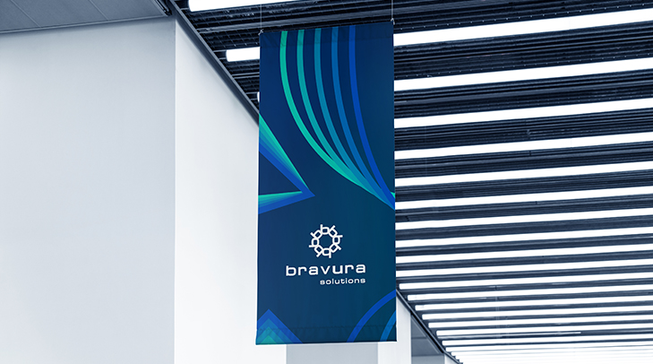
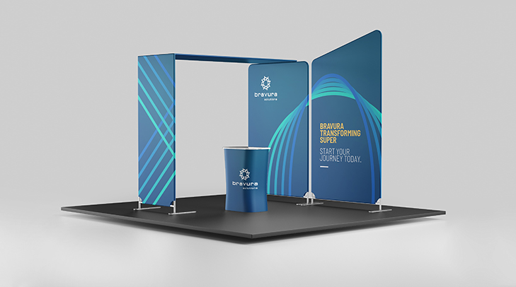
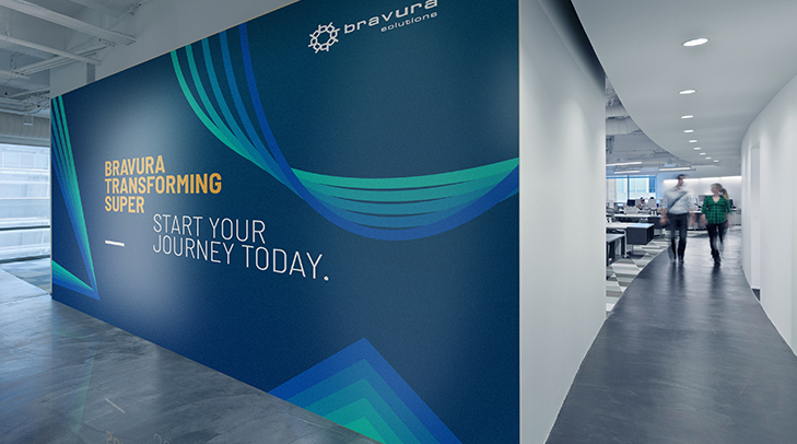
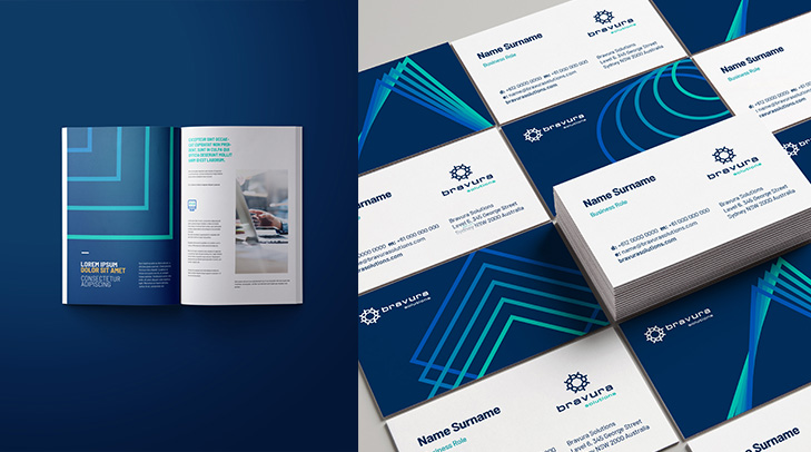
These were applied to the different touch points of the brand with its customers. They were also extended across all offices around the world, with printing and digital applications including stationery, editorial materials, office design, brochures, website look and feel, among others.
Finally, Slidemaster prepared a detailed brand guideline in the form of a navigable PDF format.
The results
The work for Bravura was a success and received a lot of positive feedback from clients and stakeholders all around the world.
Bravura now has a consolidated brand that has been used consistently across all offices worldwide. It shows a true connection between the brand and its values.